Are women discriminated against in graduate admissions? Simpson's paradox via R in three easy steps!
R has a fun built-in package, datasets: a whole bunch of easy-to-use, interesting tables of data. I found the famous UC Berkeley admissions data set, from a 1970's study of whether sex discrimination existed in graduate admissions. It's famous for illustrating a particular statistical paradox. Thanks to R's awesome mosaic plots interface, we can see this really easily.
UCBAdmissions is a three-dimensional table (like a matrix): Admit Status x Gender x Dept, with counts for each category as the matrix's values. R's default printing shows the basics just fine. Here's the data for just the first of six departments:
> UCBAdmissions
, , Dept = A

          Gender
Admit      Male Female
  Admitted  512     89
  Rejected  313     19

...
Overall, women have a lower admittance rate than men:
> apply(UCBAdmissions,c(1,2),sum)

          Gender
Admit         M    F
  Admitted 1198  557
  Rejected 1493 1278
This is the phenomenon that prompted a lawsuit against Berkeley which prompted the study that collected this data.
R's plot function is overloaded to do a mosaic plot for this sort of categorical data. Very cool. With just
> plot(UCBAdmissions)
or, playing around after reading Quick-R's page on this:
> install.packages(”vcd”)
> library(vcd)
> mosaic(UCBAdmissions, condvars=c('Dept'))
We have a plot showing admittance and gender breakdowns per department:
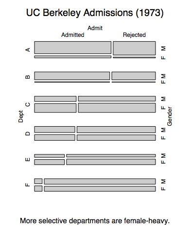
In each department, women have similar admittance rates as men. This seems to be at odds with the fact that women have a lower admittance rate overall. This discrepancy is an example of Simpson's paradox.
This mosaic also shows the explanation: Selective departments have more female applicants. It's easy to see since the departments are ordered by selectiveness. Departments A and B let in many applicants, but they're mostly male. The reverse is true for the rest. This means that the overall female population takes big admittance hits in departments C through F, while lots of males get in via departments A and B.
I think these mosaic plots are impressive for visualizing categorical proportions for high dimensional data sets. Well, by “high” I think I mean, more than 2. I can't think of a better way to see several cross relationships in categorical data at once. And the only tuning I needed to do was play around a bit with the order of those three dimensions.
Sources:
- R's UCBAdmissions help page. It comes with the standard download of R.
- R's vcd::mosaic function. I recommend the pdf vigenette about it, which has many more pictures of cool mosaic plots.
- I would post the original 1975 Science paper, but it's not freely available. I hate academic publishers.